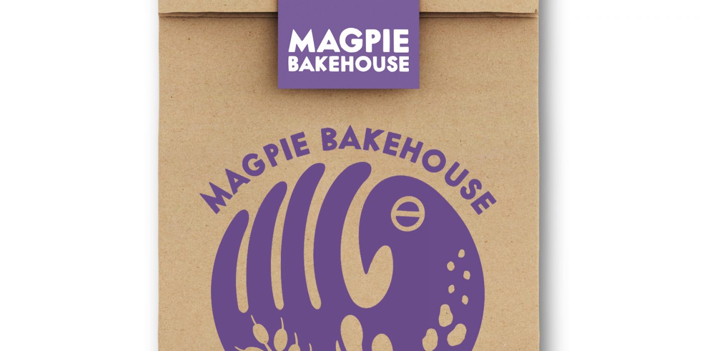
Magpie Bakehouse, logo design, 2021
Emily Keenan, the phenomenal baker behind Magpie Bakehouse, had a whimsical vision for the brand’s logo:
- Victorian nursery rhymes
- Spooky, witchy vibes
- Clean, simple Scandinavian design
- Magpie birds
- The Groke from Moomin
These ideas were mixed, stirred, and baked into a series of sketches:
![]()
After reviewing the thumbnails and picking favorites, a second round of sketches was created, narrowing in on the theme. Emily settled on a bird image that incorporated the four fundamental ingredients in bread: flour (wheat), water, salt, and yeast.
![]()
The final product turned out beautifully. A couple more fun facts: the bird’s eye is the symbol for salt, and the bird’s body is shaped like a left hand, because Emily is left-handed!
![]()